The company Coco do Vale is in Paraíba (Brazil) and has been in the market for over 30 years. It produces several products derived from coconut, such as coconut water, coconut flakes, coconut milk and coconut oil. Each of these categories with multiple SKUs.
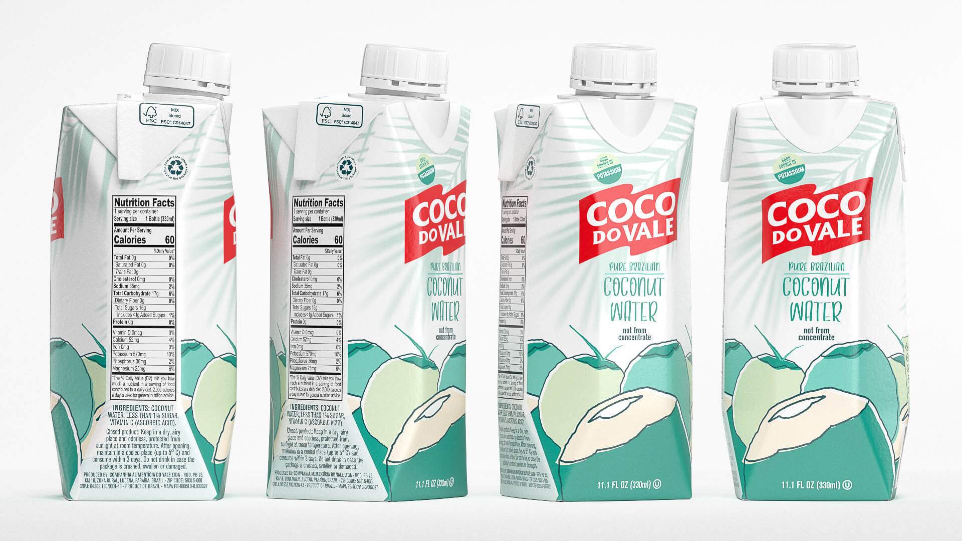
Recently the Ministry of Agriculture demanded new identity standards and analytical parameters for the Coconut Water category. With the imminent changes, Coco do Vale needed to formalize these changes in a new packaging and took this opportunity to modernize the look of the company’s Coconut Water line.
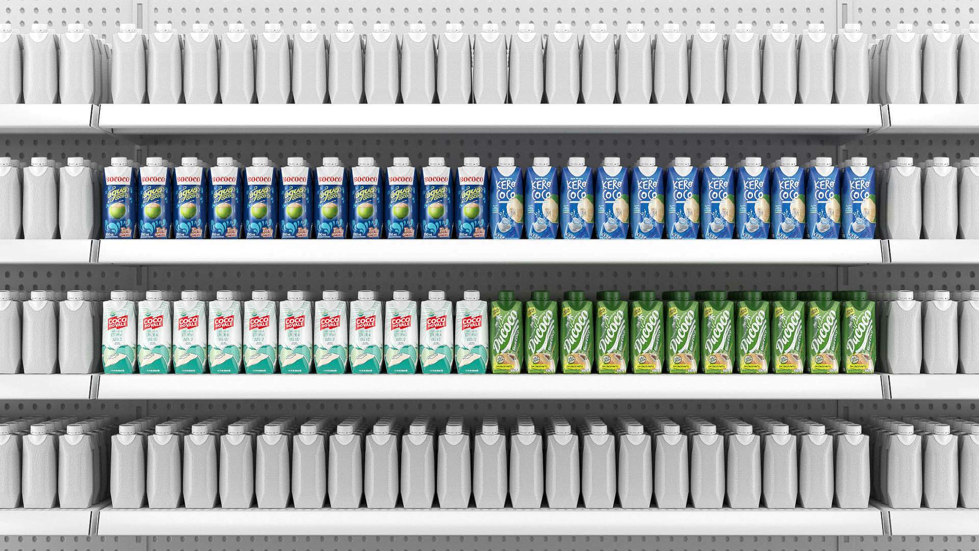
After an analysis of the evolution of the competitors’ layouts, we defined new guidelines for the new look of the line.
To update the information required by the Ministry of Agriculture on coconut water packaging and create a new visual identity that conveys more modernity without losing the current identity of the Coco do Vale brand.
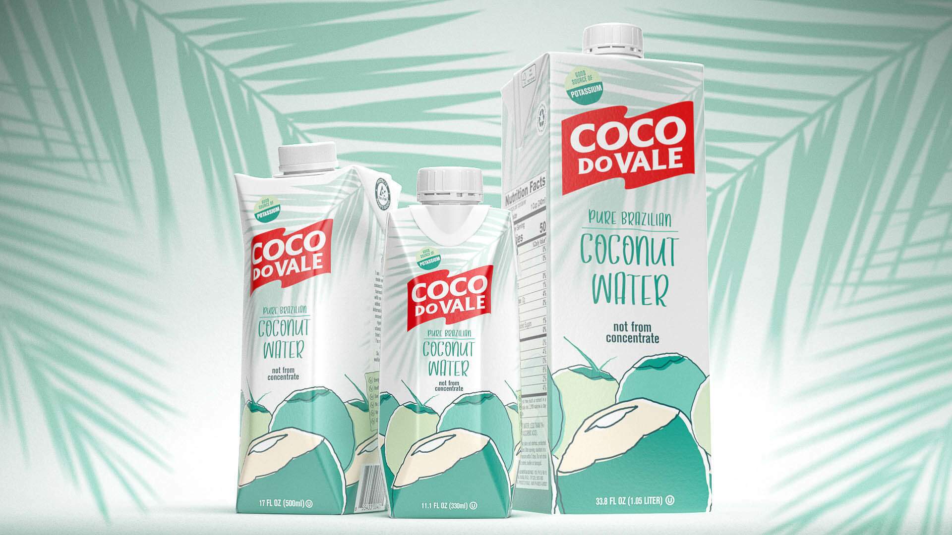
Finally, extend the look to the complete line, both in the national and international market.
After analyzing the national and international competitors, we identified the category’s language and strategically decided with Coco do Vale, to position the brand next to the foreign benchmark.
After defining the graphic patterns needed to fit this language, and we extended those patterns to both the packaging and the company logo.
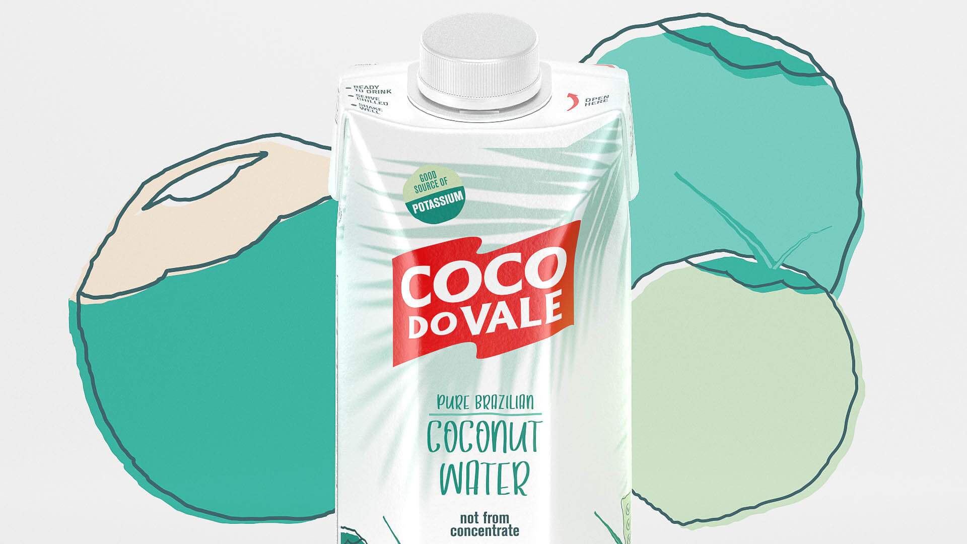
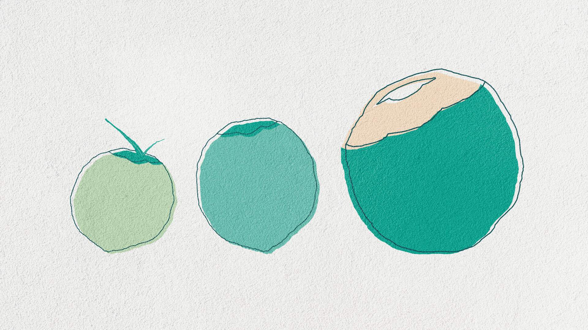
The final packaging, like the foreign references, started to communicate more efficiently product values, such as lightness, transparency, smoothness. The handmade lines and graphic elements convey the idea of close and personal care with the product. And the logo kept its identity intact, but with a contemporary graphic finish in flat colors.