Frescca is a mineral water. It has naturally mineral salts and low sodium in its composition which makes it ideal for sports practitioners, in addition to being diuretic and contributing to better digestion.
The company’s plant is among the most modern in the world, the filling process ensures that the water reaches the consumer with the same purity as at the source.
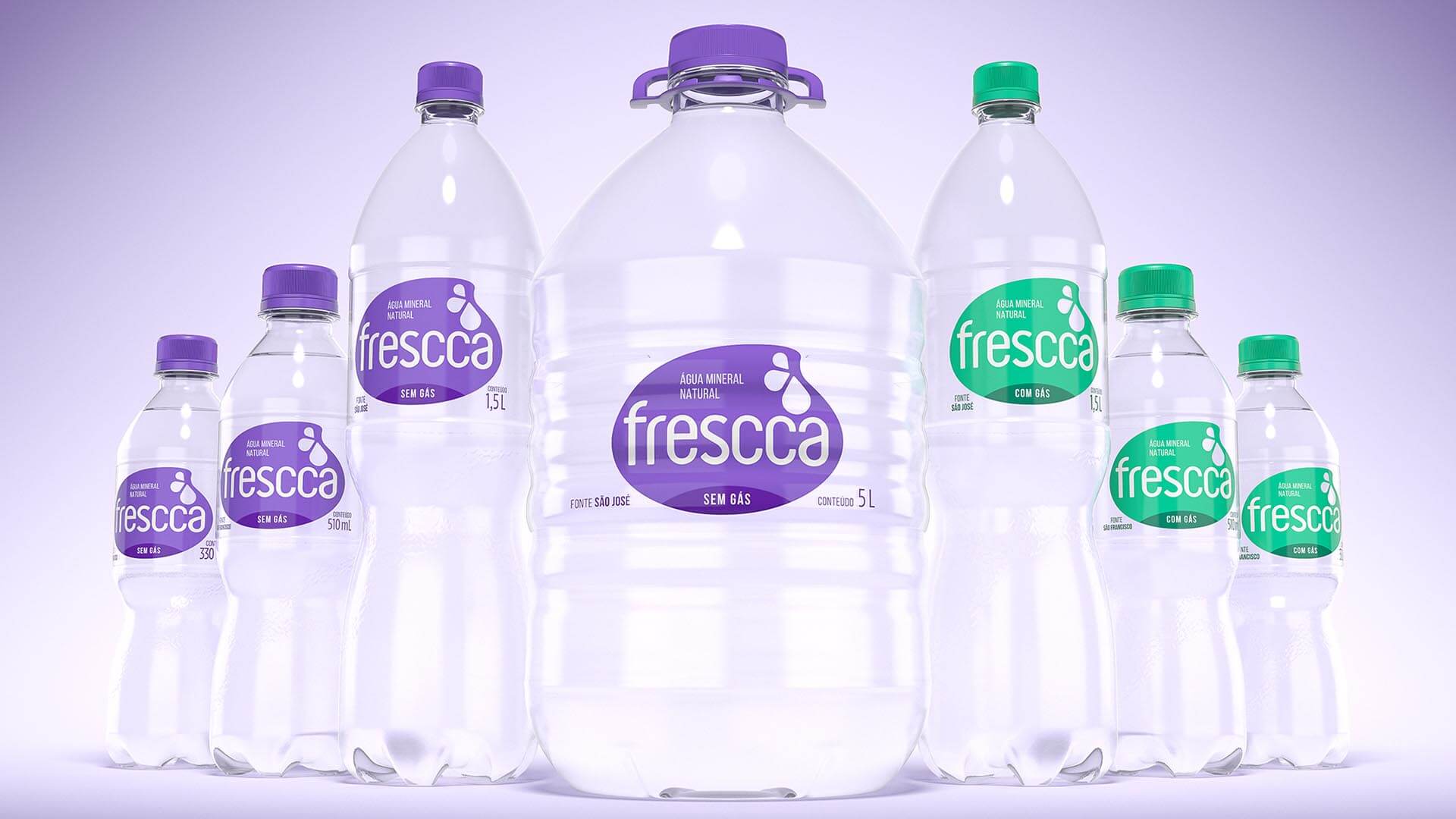
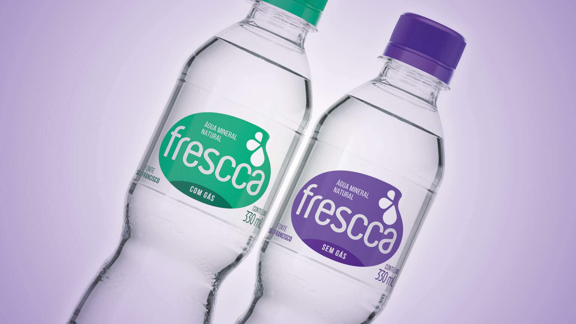
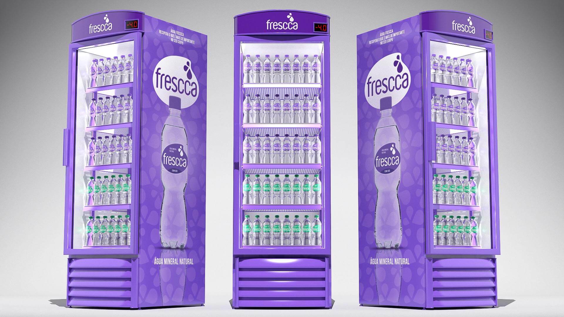
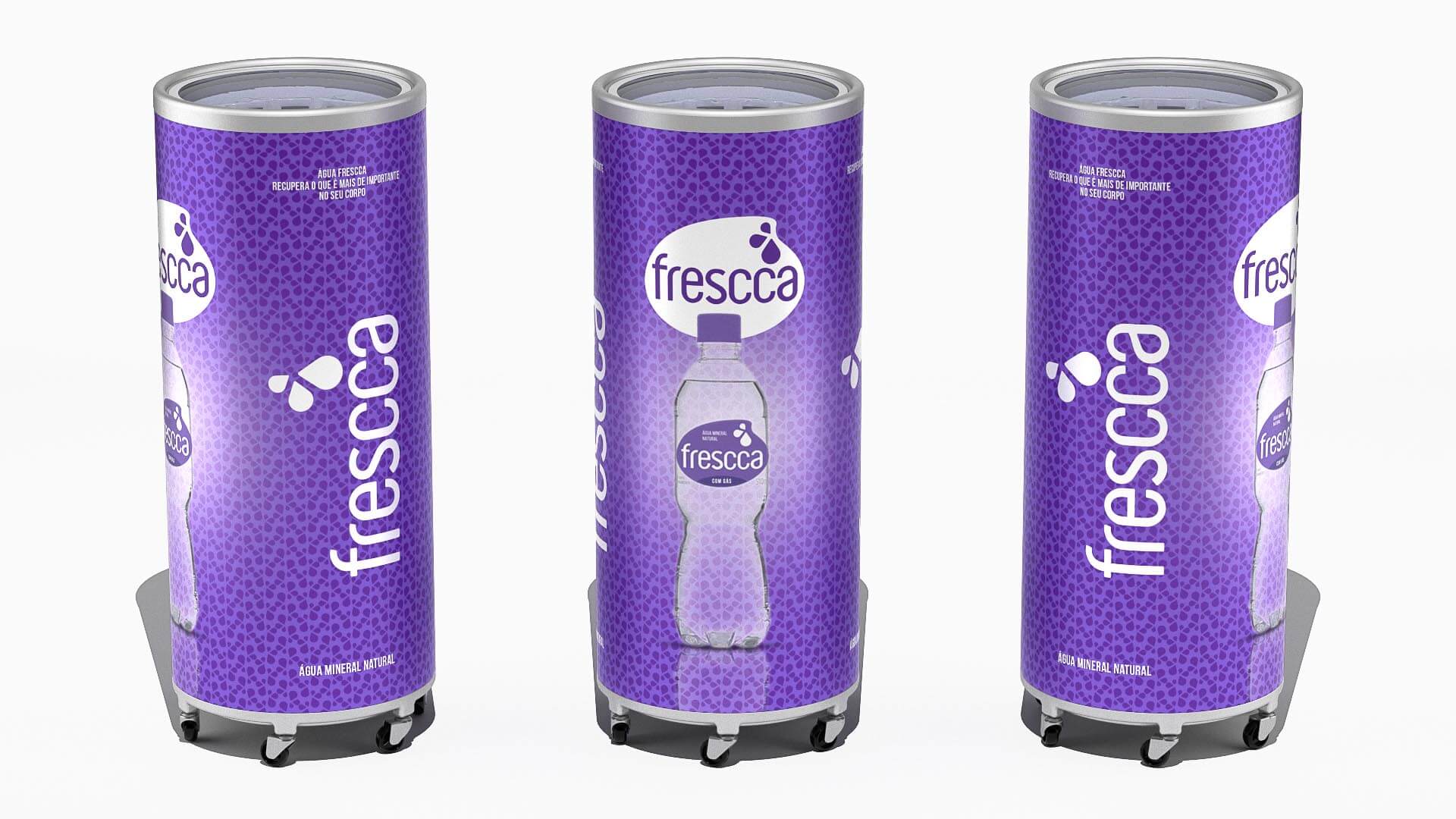
Frescca water needed a new, more modern visual identity that would reinforce its personality amid competitors on the shelf, and that would better communicate the purity and lightness of the water.
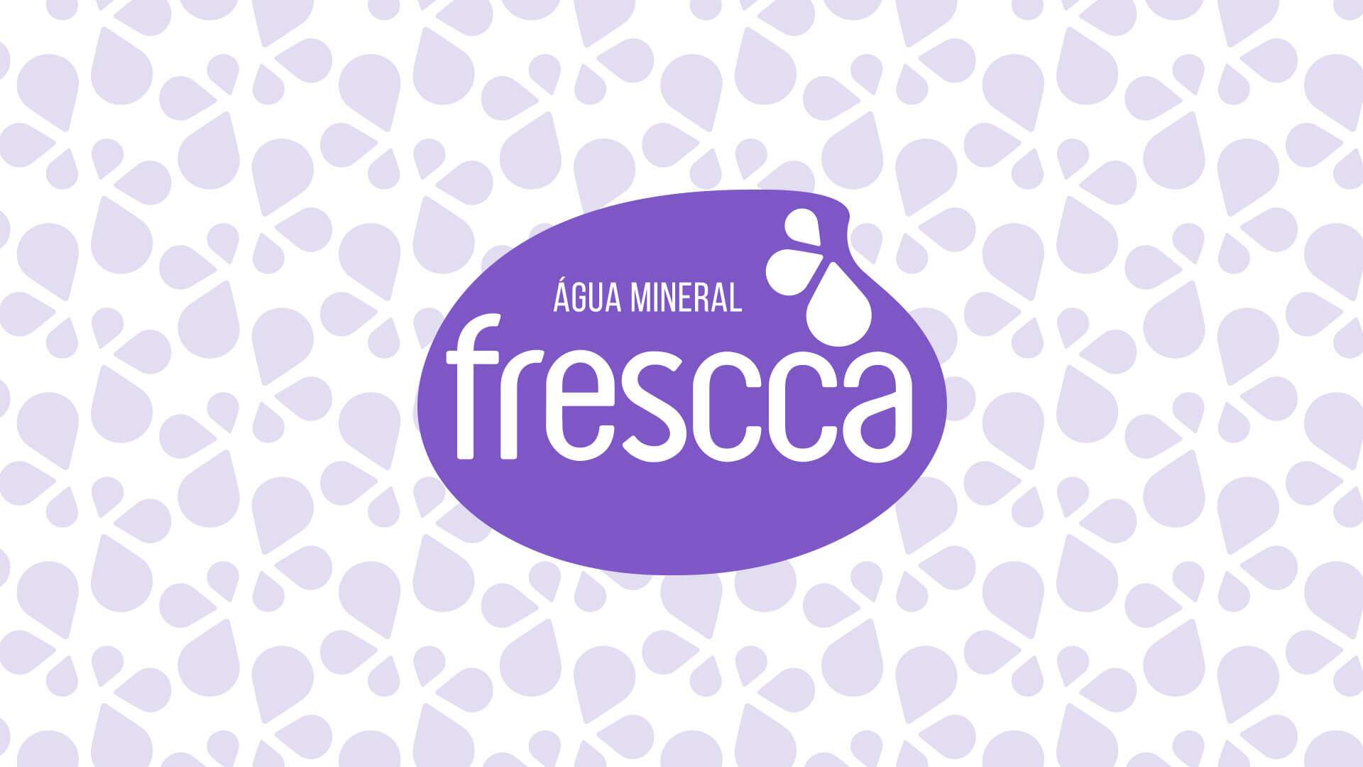
We’ve created a minimalist proposal using only essentials elements to highlight the brand, seeking to value bottled water. The graphic element that supports the logo is inspired by a drop. As part of the strategy, the typology is more modern and “friendly”, and the colors chosen are intentionally distanced from current standards.